Flexbox Child Growing Bigger than Flexbox Problem
January 26, 2024
If you've ever attempted to create a complex layout using Flexbox, you may have encountered a frustrating issue where a child element refuses to respect its parent's boundaries. Instead of fitting neatly within its container, the child grows so large that it forces the parent to expand beyond its intended dimensions—even when a fixed width has been explicitly set.
The Problem: Unexpected Layout Expansion
Consider a typical website layout with a main content area that should maintain a specific width. Everything appears to work correctly until you introduce content with particularly long lines, such as code blocks with extensive horizontal text. Suddenly, your carefully crafted layout breaks, creating unwanted horizontal scrollbars and disrupting the entire page structure.

Here's what typically happens: A blog post or content area is contained within a fixed-width parent element. When that content includes a code block with a
<pre>
In the diagram above, the blog content is rendered inside the red container. You can observe that the blog content is overflowing its boundaries, causing the entire page to expand horizontally. This overflow is typically caused by code blocks containing very long lines that extend beyond the intended page width.
Common (Ineffective) Solutions
Most developers' first instinct is to apply one of these seemingly logical fixes:
- Adding to the problematic element
overflow-x: auto - Setting to prevent growth beyond the parent container
width: 100% - Applying various combinations of and
max-widthpropertiesmin-width
Unfortunately, these approaches often fail to resolve the core issue, leaving developers scratching their heads and questioning their understanding of CSS fundamentals.
For those who want to experiment with this issue firsthand, here's a CodePen example that demonstrates the problem.
The Solution: Cascading Overflow Properties
The key to solving this problem lies in understanding how Flexbox handles overflow in nested containers. The solution requires applying
overflow: autoThis means if you have a structure like:
Flexbox Container
└── Child 1 (flexbox item)
    └── Child 2 (nested element)
        └── Child 3 (contains overflowing content)
You need to apply
overflow: auto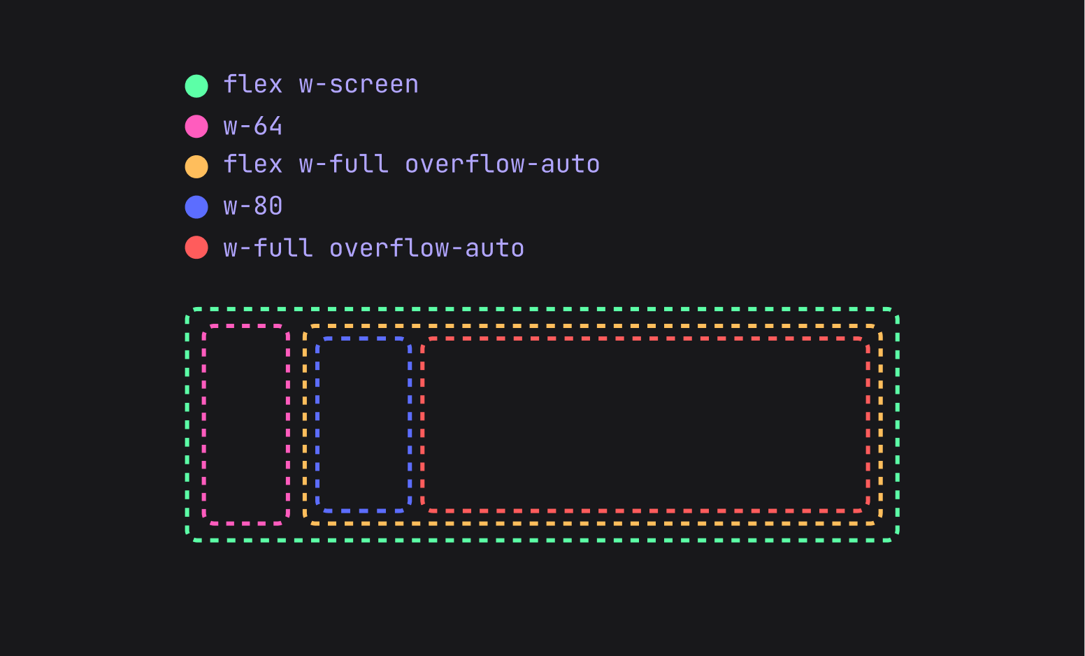
To see this solution in action, try adding
overflow-auto.child-3Why This Works
While the exact mechanics can seem mysterious, this approach essentially forces CSS to properly calculate and respect the intended dimensions at each level of the layout hierarchy. When
overflow: auto- Each container should maintain its specified dimensions
- Content that exceeds those boundaries should be scrollable rather than expanding the container
- The flexbox calculations should account for these overflow constraints
Implementation Best Practices
When implementing this solution:
- Be systematic: Apply overflow properties consistently through your element hierarchy
- Test thoroughly: Verify that the fix works across different content types and lengths
- Document your approach: This behavior can be counterintuitive, so leave comments explaining why multiple overflow declarations are necessary
- Consider alternatives: In some cases, restructuring your HTML hierarchy might provide a cleaner solution
Conclusion
CSS Flexbox is a powerful layout tool, but it can exhibit unexpected behaviors when dealing with overflowing content in nested structures. By understanding that overflow properties need to be applied systematically through parent-child relationships within flexbox contexts, developers can maintain control over their layouts even when dealing with unpredictable content lengths.
This solution demonstrates the importance of understanding how CSS properties interact across multiple levels of document structure, rather than assuming that styling individual elements in isolation will always produce the desired results.